pigmento
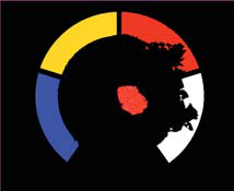
Pigmento is a color experience to enrich learning awareness. It works by moving a granular material over the surface, which it is projected from inside. The research was intended for developing a natural learning process despite of the culture and previous experiences, from school to any other scenario. Possibly, with more learning applications in the future. This is my master thesis and it has been developed later at maisongb.
1 - How it started
Pigmento was born as a master thesis project in Interaction Design at IUAV University in Venice. This is overall invented and designed by me, Giuseppe Burdo with the initial mentoring support of Davide Rocchesso, Gillian Crampton Smith and Philip Tabor at IUAV University. After attending several workshops for kids in Guggenheim Museum in Venice, I was very surprised by the mind of 4-5 yr old kids. Their no-previous experience and discovery attitude gave them the power of instantly learn and make connections, unthinkable for many literate adults. A good topic for exploration in this age is about colour theory. The main task is how to get derivate colours and I was thinking to design an interface where they could touch and manipulate with ease and instantly, because kids can get very bored if something doesn't happen straight away. I was fascined by Bill Verplank on enactive technology, this is why I was planning to use a liquid or granular material.
2 - Look and Feel
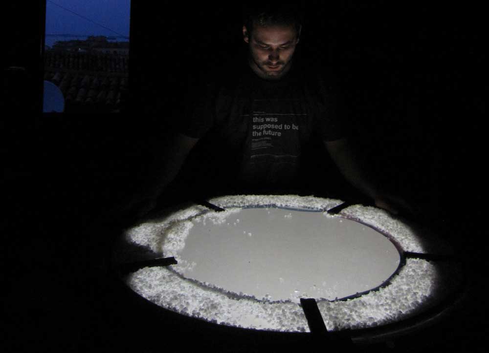
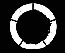
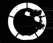
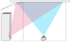
Splitting and merging water on a table was quite annoying as user experience. Also, many variables can affect the overall interaction: temperature, hygiene, weak control on manipulation. Then I came up with coarse salt, after trying other powder-liquid materials. Salt and pigments share some stories. They were of high values, carried from Orient and they can be minerally similar. Also I was looking for a cheap and white/opaque material which would never affect kids health. The magic aspect is about videoprojecting the salt of light, with the same behaviour of colours. This gives the flexibility of using the same material, with all the advan../tages a software can provide. This prototype is just time-based and the aim is to see what happens from a user point of view over the touch, sight and sound senses.
3 - Computational tinkering
Before defining the overall design, my priority was to see how far I could go through prototyping. I was supposed to work all alone, apart tips and tricks from few friends and from web communities such as OpenFrameworks or Processing and generally about computer vision libraries. After few of the latters, I had the feeling to do much more in OpenCV. The basic features were to split some amount and to merge all again the groups, in an endlessy process with every kind of amount. The colour is still quite random (I just added a certain amount of H value on the HSB scale).
4- Building the prototype
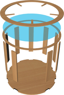
One of my favourite parts is when it comes to the building. I had to show the proof of concept at University, so I decided to make a very basic structure. The hardest part was to calibrate all the components together. At the moment I had a long throw optics projector. Because of this, I had to use tricks as several mirrors, again quite dirty. I'm anyway very grateful to Davide De Lucrezia of Explora Biotech, otherwise I could not do prototyping at all.
5 - Color Science
I started to write my thesis only after the first technical prototyping iteration. As I was studying from any available media, I got very inspired by Giuseppe di Napoli, with the book called "Il Colore dipinto". One great point was about colorito vs. colorato, where the first is made up of tiny points of different colours where the overall feeling is just about one. The colorato means that all the pigments are the same. In nature, everything seems to be in a colorito way, for example in leaves, stones, natural fabrics and so on. Also, there is a huge difference between colore and colorante, where the first one is matter and the second is just some colour added to a material. Well, I wanted that all the salt, and specifically, each material part was conveying colours and not something just added. This led to an awakening discovery: I could make possible what impressionist and scientists were talking about: putting dots of different colours would give the imperssion of some other ones. This was even more interesting considering I was making the subtractive synthesis colour with lights. Here I got the chance to meet Arch Cristina Boeri from the Colour Science Lab in Milan Polytechnic, where my interest was to intestigate deeper in the field.
6 - all round design
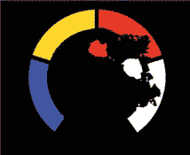
After few chapters of thesis writing, I still had to manage big problems about the user interaction. I spent a weekend with my friend Francesco Saccone who is an automation engineer, trying to figure out how to develop it further than I could do by myself. After few days of pessimism with a deadline in four days, two great ideas came to my mind. One was to have a rounded surface instead of a rectangular one, splitting the surface in two areas: lateral and central. In the lateral one there are the primitive colours and in the central one the users can literally and physically mix themselves to get the derivative. In anytime they could go back and be on their own. The other one was to use all the surface, because in any time they could move salt wherever, whithout having any no-use areas. I previously thought it was my lack of knowledge about openCV. Then I realised the design was wrong, or better poor designed. I was missing how the game could start, continue and possibly finish. Also, without defining the colour splitting and mixing, which is a matter of science, not a random experience.
7 - Product and code
Once again I needed to build both the structure and some simple code in order to verify what only my ideas were about. After two years at IUAV University, I was lucky enough to manage pretty well most of the tools in the wood lab, so I made it by myself. Meanwhile on the code, there were three challenges: identify and colour the lateral areas, to track the missing salt on that surface, to generate the derivate colour. It was very complex also because the endless changes of room light. Here Daniele Muscella was of essential help.
8 - User testing
A step behind this one, I only was going by guessing. As I started showing the table to some children, I got incredibly happy about their reaction. Those moments were full of insights and satisfaction. I used to play few tricks, showed in the second video, and they were able to already have expectations after few minutes of use. This meant it was easy to understand. Of course it was a mockup and some features were not developed.
9 - Thesis Presentation
Team Building
After two months of my thesis presentation, I got an email from Genoa Science Festival saying that someone of the staff would have been calling me shortly. This was Francesca Messina, from National Research Centre (CNR). I was extremely surprised and pleased because I didn't expect it. The main point was to deliver a product, not a prototype. Then I started asking to few friends willing to face the challenge with me. In a very informal way, I met Emanuele Libralato, software engineer based in Venice.
team
- Emanuele Libralato
- CREATIVE TECHNOLOGY
- http://tenko.it
- Salvatore Santaniello
- EXHIBIT ILLUSTRATIONS
- http://toucis.it
- Achille della Grazia
- EXHIBIT SETUP
mentors
- Arch. Cristina Boeri
- COLOUR AND PRODUCT
- Milan Polytechnic University
- coloret.polimi.it
- Prof. Davide Rocchesso
- COMPUTER SCIENCE
- Venice IUAV University
- iuav.it
- Prof. G. Crampton Smith
- Prof. Philip Tabor
- INTERACTION DESIGN
- Venice IUAV University
- interaction-venice.com
institutions
- IUAV
- MILAN POLYTECHNIC
- CNR
locations
- Rome
- Faculty of Engineering
- National Colour Conference
- Venice
- Telecom Italia Future Centre
- European Researcher's Night
- Genoa
- Palazzo Spinola
- National Festival of Science
support
- EPSON, GIORGIO GIRELLI, MARCONATI VETRI, EXPLORA BIOTECH, RETURN INFORMATICA, SCIUTTO EXHIBITIONS
media
- weme, martimex, laweb.tv, branchie
friends
- Francesco Saccone, Luca Mancini, Daniele Muscella, Matteo Moretti, Igor Azteni, Maura Riva, Giorgia Setti
Fundraising
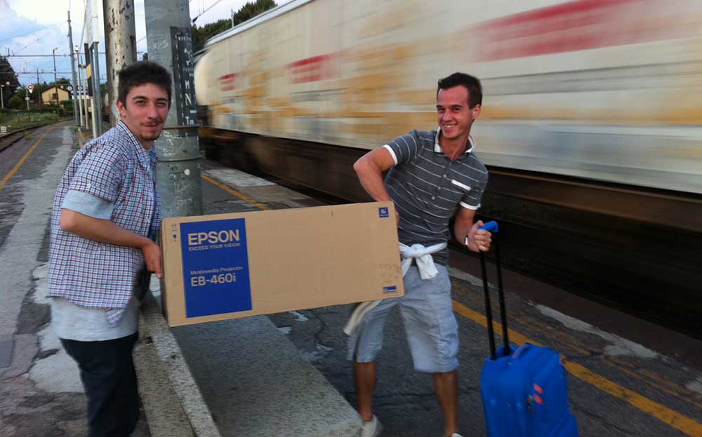
The kickstart came from EPSON, thanks to Carla Conca and team, VP Projections. Meanwhile I had the support from a very good friend of mine, Salvatore Santaniello, specialised in Graphics and Illustration. Beside his very young age, he already was talent enough to have an extensive and professional design experience in all media, including for kids.
Institutional patronage
The tricky part was to make sure people could get what the project was about. We ended up being asked to exhibit also in Venice, along the European Researcher's Night. Beside the IUAV, we were glad to have Cristina Boeri onboard, architect and colour design specialist inside the Indaco Lab, Milan Polytechnic. Pigmento was also guided by the CNR, National Resercher Center, with our reference Francesca Messina, member of the Genoa Science Festival.

Technical development
Processing with the supported OpenCV library were not enough for the computational challenge. Because of prototyping reason, I didn't manage to develop the most complex features, for example different blob filling in the central area. The best candidate now was OpenFrameworks, an open source C++ toolkit with the complete version of OpenCV and OpenGL. Also the setup was now changing with the new devices: the EPSON videoprojector and a professional unibrain camera, combined with a grandangular optics because of the short distance.
Design Development
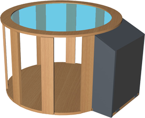
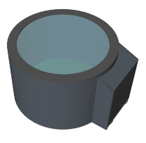
Few of the renders delivered to Giorgio Girelli, wood professionals in Venice Area. We are extremely grateful for their support in making this happen.
Building
In order to test ideas, it's good to use the quickest possible way. But now pigmento would have been used from many people, especially from kids. So it needed to be robust and precise to keep all the components working well together. The final look and feel was designed according to the Reneissance experience in the main exhibition. This was carefully done by Falegnameria Giorgio Girelli, based in Venice. At the top of the table there was a glass, gently provided by Marconati Vetri.
Scientific presentation in Rome
Pigmento was accepted as long paper in the volume "Colore e Colorimetria", curated by Maurizio Rossi from Milan Polytechnic, published for Maggioli Editore. The two days conference In 2011 was held at Faculty of Electronic and Aerospace Engineering at La Sapienza University, in Rome. Here pigmento had a spot as a poster presentation. Being here was a confirmation about the effort on making the experience truly educational rather than entertaining.
Preview in Venice
The Researcher's night is the annual appointment all over Europe, where University researchers show their projects to the general public. Pigmento was invited from IUAV to give a preview inside the medieval palace owned by Telecom, in the heart of Venice. The space was simply perfect, because of the architecture and the lighting. The aim was to explain what the project was about to adults and to let children play with it.
Main exhibition in Genoa
Genoa Science Festival is the most relevant of the kind in Italy, where hundreds of activities are held within the city of Genoa in several locations. Events span from workshops, lectures, demos, talks and so on. Usually the number of people attending the event are around 300,000 each year about any age. The topic of year 2011 is about "150 and behind" which reminds the Unification of Italy and the guest country is USA.
The National Gallery Spinola was built in 1593 for Francesco Grimaldi in the heart of Genoa and represents one of the most relevant collections for the local area. It was own by the richest family in the city as Pallavicino, Doria, Spinola and there are canvases, wall paintings, interiors and ceramics. Some works include Rubens, Daa Messina, Van Dyck and several other Reinassance artists.
Making colours was considered an art on itw own. Before painting, especially at that time, there was a long process in order to make pigments ready, from mining, to transports and processing. The latter was usually done in the ateliers. On the other side, the theme "150 and beyond" came from the numbers of possible mixed pigments used by Italian painters.
Event
Festival della Scienza, Genovahttp://www.festivalscienza.it Venue
Galleria Nazionale di Palazzo Spinolahttp://palazzospinola.it Why Pigmento
Galleria Nazionale di Palazzo Spinolahttp://palazzospinola.it
The space
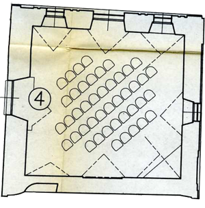
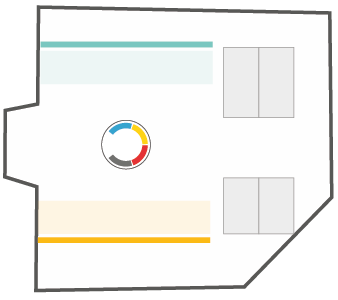
Because of the technical requirements, the location is indoor. The room is usually intended for didactic purposes for school groups after visiting the Museum. The only constraint is about the almost no possible intervention on the walls and ceiling, because of the hystorical importance of the building. Also, it's not possible to work outside normal office hours, which requires a strict schedule on the setup. The area is mainly divided in 2 sides: partecipants involved in the de facto exhibition, and some others on the back for possible workshop activities.
Current Space
Didactic room, Palazzo Spinolahttp://www.palazzospinola.it Designed Space
Didactic room, Palazzo Spinolahttp://palazzospinola.it
Art, Science, Play
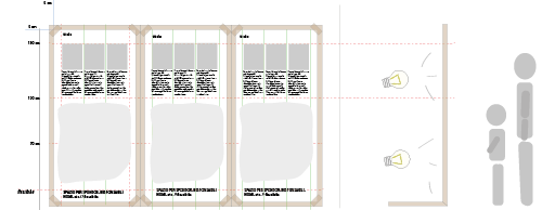
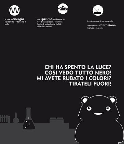
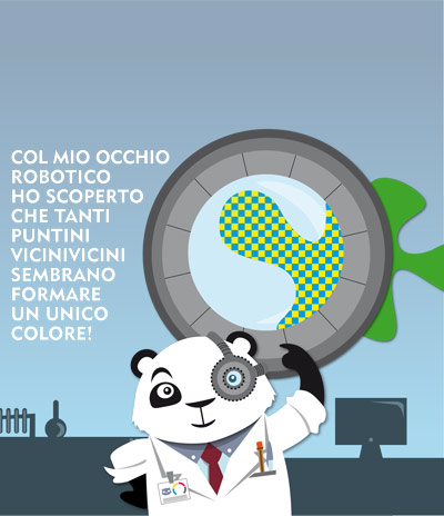
The hands-on experience is guided by the Festival animators Laura and Adele. The path is designed for any people age. The goal is to discover connections between Art and Science, in light and colour. Those two series of panels are parallel, representing everytime a different point of view. The content is visually explained differently according to people age and experience. From the bottom, with the characted developed by Salvatore Santaniello, to the top relating to the Museum works of art and other details. Main content contributor for the art series is Matteo Moretti.
Representation
Didactic room, Palazzo Spinolahttp://www.palazzospinola.it
The Character
Science 1
Savatore Santaniello, All rights reserved Science 2
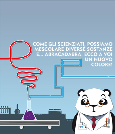
Savatore Santaniello, All rights reserved Science 3
Savatore Santaniello, All rights reserved Art 1
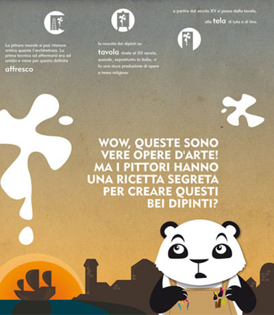
Savatore Santaniello, All rights reserved Art 2
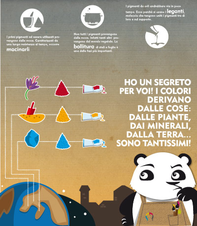
Savatore Santaniello, All rights reserved Art 3
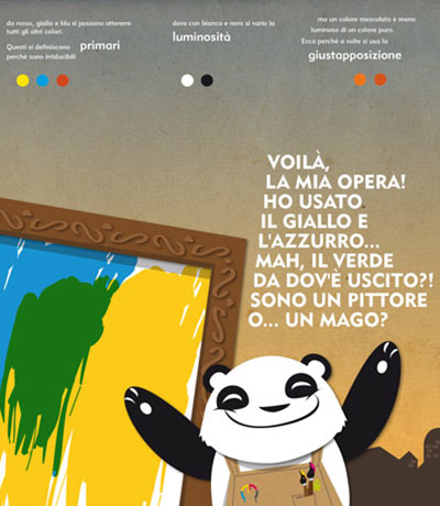
Savatore Santaniello, All rights reserved
Check all pictures on Flickr
physical 
html, js, art 
mobile, ux, graphics -
product, installation 
3D, video 
graphics, art 
max msp, arduino 
graphics, research 
installation, arduino 
colour, product 
processing, psychology 
graphics, ixd 
graphics 
hardware 
processing, psychology 
bci, product, arduino 
graphics 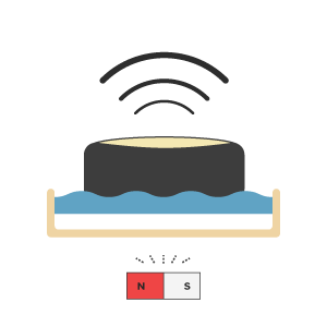
installation, arduino 
hack, arduino 
graphics, ixd